Hello There , I see , You're a guest?
Oh not a big deal as you can see , you're able to see only some forums , because the forum's more member friendly and you'd be able to see all the forums which our members are able to see , and with 10+ posts you can see the "Renders Gallery"! All that just FOR FREE!!
Can you believe it? I mean , I can NOT! Haha , what are you waiting for? Register now! or Log in if you're already a member Smile

Join the forum, it's quick and easy

Hello There , I see , You're a guest?
Oh not a big deal as you can see , you're able to see only some forums , because the forum's more member friendly and you'd be able to see all the forums which our members are able to see , and with 10+ posts you can see the "Renders Gallery"! All that just FOR FREE!!
Can you believe it? I mean , I can NOT! Haha , what are you waiting for? Register now! or Log in if you're already a member Smile
Would you like to react to this message? Create an account in a few clicks or log in to continue.

You are not connected. Please login or register

Go to page : Previous  1, 2, 3  Next

View previous topic View next topic Go down  Message [Page 2 of 3]

26Mintjam Junk - Page 2 Empty Re: Mintjam Junk Sun Oct 03, 2010 2:35 am

mikefx


Sr. Castle Member
Sr. Castle Member
Yeh, i got more downs than ups.. Laughing
and yeh, your last sig could do with a bit of work Minty.

27Mintjam Junk - Page 2 Empty Re: Mintjam Junk Thu Oct 14, 2010 10:37 am

Mr. MINTJAM


Sr. Castle Member
Sr. Castle Member
I fell off the graphics bike.. but I think I'm learning to ride it again.

Mintjam Junk - Page 2 11083103z

Mintjam Junk - Page 2 K35d1y

I'll be back with more this weekend, I think. Getting over a creative block is a troublesome thing.

http://mr-MINTJAM.deviantart.com

28Mintjam Junk - Page 2 Empty Re: Mintjam Junk Thu Oct 14, 2010 1:25 pm

Dark Duelist


Ex-Staff
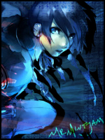
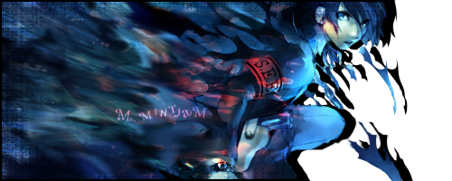
Hmm'z.. the first sig is needs some work on flow and colours.. don't cover the render with effects.. just ruins it.. the effects are quite random but ok.. the signature overall is kinda too dark.. I see some sharpening there but I dunno.. can't really see well.. the second sig is quite good.. the motion blur is effective but you put too much of it.. quite plain.. I like the border though.. it's cool x]

29Mintjam Junk - Page 2 Empty Re: Mintjam Junk Thu Oct 14, 2010 1:51 pm

Mr. MINTJAM

Mr. MINTJAM
Sr. Castle Member
Sr. Castle Member
The first one isn't a render at all. Just a manipulated image. I never understand when you say 'flow'. I was a digital media student, and I never really knew flow as anything. I'm a very literal guy, some sort of explanation of the word would settle my concerns over it.
The intention for the banner is for it to be dark, but it's not too dark. It's lighting looks different on both of my screens, but it's be no means too dark. It's a 'happy-dark in a trigger-happy way' kind of theme for it. The effects go with the image; in her hand is a gun, over the gun is just a 'glow' kind of thing that wraps around her arm slightly, as a weapon discharge of sorts. It's mixed with a burn filter, so it might look a bit sharpened. The blood splatter is to go with the blood-lust, to give a more morbid feel. It was far too plain without anything over it. Really, the splatter is the only thing covering her noticeably.

Maybe check your screen Wink Unless my screens are both excessively bright.

The second has more work than it seems. Rendered 'ghosts', duplicated, shape-blurred, mirrored. Maybe I could have made the colours that I have blended into the black a bit more noticeable, but it seemed too much, so I've toned it down. For it's purpose, plain is better. I think that a lot of banners with 'C4D', or fractals as they're originally called, are too busy. It felt nice to not work with abstract things.

I need to find my old brush packs for better borders =/ Or just name them so I don't have to guess. I clear my brush list every time I close Photoshop, it slows the start-up otherwise.

http://mr-MINTJAM.deviantart.com

30Mintjam Junk - Page 2 Empty Re: Mintjam Junk Thu Oct 14, 2010 2:08 pm

Dark Duelist

Dark Duelist
Ex-Staff
Lulz.. kay.. firstly.. flow.. I'm pretty sure they probably won't use that term in any GFX classes or whatever you go to Razz But flow is quite hard to understand.. but someone made a tutorial about it..

Spoiler:

FULL CREDITS TO FLODIAN FOR THIS TUTORIAL!

But anywayz.. I can't be bothered to add all the pictures he made but just read what it's about.. you'll get a decent understanding of what the term "flow" means..

In my opinion.. I see that your sig is too dark.. covering the render with effects seems bad in my eyes.. but every designer has their own opinions.. eh.. in my opinion.. I think that the second sig has too much motion blurs.. they "worked" on those monster thingys Razz But it doesn't seem to work on the text or the pacman yellow thingy Razz

31Mintjam Junk - Page 2 Empty Re: Mintjam Junk Thu Oct 14, 2010 2:38 pm

Mr. MINTJAM

Mr. MINTJAM
Sr. Castle Member
Sr. Castle Member
What... It's just like using lines to draw the eye and direction blurred backgrounds. It only really applies when there's something to add 'flow' to. Now I know why this is the first and only graphics based place I've ever joined; they over-complicate.
I went and found where you got that from for the images, because the descriptions are misleading without them. All the same, I don't see really what is meant by it in all those sub terms =/ Doesn't matter though, I'm not serious about this stuff. My art lies elsewhere Rolling Eyes

Each to their own though, it's why there should always be a wide range of artists on one site.

http://mr-MINTJAM.deviantart.com

32Mintjam Junk - Page 2 Empty Re: Mintjam Junk Thu Oct 14, 2010 2:51 pm

Dark Duelist

Dark Duelist
Ex-Staff
Yep.. I agree.. each to his own Smile And if there's a render.. there should be flow xD Lulz.. anywayz.. I talk about this stuff.. coz I'm used to this stuff I guess.. but if you don't wanna hear it just say Very Happy

33Mintjam Junk - Page 2 Empty Re: Mintjam Junk Thu Oct 14, 2010 5:16 pm

Mr. MINTJAM

Mr. MINTJAM
Sr. Castle Member
Sr. Castle Member
I'm just an experimenter, a photomanipulator, not part of the 'GFX world'. As long as things please my eyes, then it's fine for me. Other people liking it is just a bonus Smile Making things to appeal to a majority, I've already learnt that that's the thing that breaks a person if they don't have the will for it.
So I don't mind the graphics talk, 'cause it's nice someone's noticing.

Mintjam Junk - Page 2 2v920w2

Back to the experimenting board, I'm having someone set me random themes to play with. The high lady has dubbed the next one as 'bats', so something not anime is coming in my next post.

http://mr-MINTJAM.deviantart.com

34Mintjam Junk - Page 2 Empty Re: Mintjam Junk Fri Oct 15, 2010 12:01 am

Lightbulb621

Lightbulb621
Sr. Castle Member
Sr. Castle Member
Well first off, I love the colors<3
And then, I feel like the left side is a bit empty/the background looks a bit odd with the popping circles. It would also be nice if the girl was blended with the background.

Mintjam Junk - Page 2 2mxeq7n
Looove this one.<3 You used smudging on the right side?

Mr. Minjam wrote:The first one isn't a render at all. Just a manipulated image. I never understand when you say 'flow'. I was a digital media student, and I never really knew flow as anything. I'm a very literal guy, some sort of explanation of the word would settle my concerns over it.
Yarr, if it's a manipulated image, the 'flow' doesn't matter that much. The main thing to look at in banners/sigs is the compo, focal, and effects.

35Mintjam Junk - Page 2 Empty Re: Mintjam Junk Fri Oct 15, 2010 3:08 am

Dark Duelist

Dark Duelist
Ex-Staff
Hmm'z.. firstly.. your latest sig.. I think it's pretty nisch.. render doesn't seem to need blending.. but I agree with Lighty when she says it's quite plain on the left side.. I like the splatter brush on the left side.. it just gives it that extra taste Razz And sorry if I may sound stupid to you.. but what's compo? It ain't in my GFX Dictionary Razz

36Mintjam Junk - Page 2 Empty Re: Mintjam Junk Fri Oct 15, 2010 7:43 am

Mr. MINTJAM

Mr. MINTJAM
Sr. Castle Member
Sr. Castle Member
Compo = Composition.
Or at least, that's how it translates for me.

I was thinking of adding stylised text to the left side, but couldn't think of anything... So it's pretty much a blank banner, as it is.

Lightbulb621 wrote:Mintjam Junk - Page 2 2mxeq7n
Looove this one.<3 You used smudging on the right side?
Yeah, it's the smudge tool, I love it. I'm slowly finding more uses for it.

http://mr-MINTJAM.deviantart.com

37Mintjam Junk - Page 2 Empty Re: Mintjam Junk Fri Oct 15, 2010 8:33 am

Dark Duelist

Dark Duelist
Ex-Staff
Ahh KK... And that's the smudge tool?? o.o Wow.. pretty skilled at using it o.o I thought it was a brush blending in with the sig o.o Nisch work ;o

38Mintjam Junk - Page 2 Empty Re: Mintjam Junk Fri Oct 15, 2010 2:00 pm

Lightbulb621

Lightbulb621
Sr. Castle Member
Sr. Castle Member
Mr. MINTJAM wrote:
Lightbulb621 wrote:Mintjam Junk - Page 2 2mxeq7n
Looove this one.<3 You used smudging on the right side?
Yeah, it's the smudge tool, I love it. I'm slowly finding more uses for it.
Yeah I really love the directions of the smudging, almost looks like there are flowers^^
Mehh I need some smudging tuts. Would help me tons right now. xD

39Mintjam Junk - Page 2 Empty Re: Mintjam Junk Sun Oct 17, 2010 3:59 am

Mr. MINTJAM

Mr. MINTJAM
Sr. Castle Member
Sr. Castle Member
You'll have to share tutorials with me xD I've never used one, never known what to look for. I just do whatever I can think of and see where it takes me.

I use the smudge tool the same way I'd use a paintbrush on a wet canvas. Smudgeeeee. the strength would be the same as how much pressure you'd put on the brush... Kind of. I guess that's what it's supposed to mimic though xD

You know, I never started using those C4D things properly until this banner. And even that's tiny and behind stuff.
Mintjam Junk - Page 2 Xfrawz
Before that, it was just brush work, layer adjustments and smudge... Well, besides the blue Ignus Orsus banner. But that wasn't personal work. Maybe I'm just catching up with the 'times' now. Very Happy

http://mr-MINTJAM.deviantart.com

40Mintjam Junk - Page 2 Empty Re: Mintjam Junk Sun Oct 17, 2010 10:43 am

Lightbulb621

Lightbulb621
Sr. Castle Member
Sr. Castle Member
Ahaha the 'times' xD
Well I've seen some tuts for smudging but I'm gonna need to look for them again. Razz

Oh yeah, I get what you mean about the paintbrush. Blahh I wish I was good at painting. It's one of my worst mediums, after pen&ink. xD Oh godddd.

41Mintjam Junk - Page 2 Empty Re: Mintjam Junk Fri Oct 29, 2010 8:53 pm

Mr. MINTJAM

Mr. MINTJAM
Sr. Castle Member
Sr. Castle Member
Back again, after some poking at things.

Mintjam Junk - Page 2 Perso11

I didn't think much at all while doing this. I'll probably change the text, I'd had enough by the time I got to it.

http://mr-MINTJAM.deviantart.com

42Mintjam Junk - Page 2 Empty Re: Mintjam Junk Fri Oct 29, 2010 8:57 pm

Lightbulb621

Lightbulb621
Sr. Castle Member
Sr. Castle Member
I love the concept of this sig. I find the random blotches of red and the border a bit strange to the eye. But I love the idea of this^^

43Mintjam Junk - Page 2 Empty Re: Mintjam Junk Sat Oct 30, 2010 4:27 am

Dark Duelist

Dark Duelist
Ex-Staff
Hmm'z.. I like this sig! Very Happy It has what I call "flow".. it's pretty nisch.. however the red does seem distracting.. and ye.. text needs work.. you always use that font ;o But nisch work! x]

44Mintjam Junk - Page 2 Empty Re: Mintjam Junk Sat Oct 30, 2010 6:20 am

Mr. MINTJAM

Mr. MINTJAM
Sr. Castle Member
Sr. Castle Member
As I said about the text, I'd had enough xD I ripped it off my previous sig. I'll probably change it later tonight. I have like, 10 minutes until my parents arrive.

I actually kind of like the red, but I'm the creator, I'm biased xD Here's what it looks like without:
Mintjam Junk - Page 2 Mh3v47
Too much blue... I did have more noticeable green in it, but that vanished after an hour. I'm having more ideas for it now, so chances are, I'll rework it.

http://mr-MINTJAM.deviantart.com

45Mintjam Junk - Page 2 Empty Re: Mintjam Junk Sat Oct 30, 2010 6:24 am

Kira

Kira
Ex-Staff
Yeah I prefer the red one. looks a lot better. As you said the second one has too much blue.

http://www.gaming-galaxy.forumotion.com

46Mintjam Junk - Page 2 Empty Re: Mintjam Junk Sat Oct 30, 2010 6:28 am

Dark Duelist

Dark Duelist
Ex-Staff
Nah.. I like the second one Very Happy

47Mintjam Junk - Page 2 Empty Re: Mintjam Junk Sat Oct 30, 2010 3:19 pm

Mr. MINTJAM

Mr. MINTJAM
Sr. Castle Member
Sr. Castle Member
I've lost hope in text >.> I might start removing them from my computer. And start just writing my stuff with my pen tablet.

Does anyone know how to make their own text? I was vaguely taught how to in college, so I might try my hand at it.

http://mr-MINTJAM.deviantart.com

48Mintjam Junk - Page 2 Empty Re: Mintjam Junk Sat Oct 30, 2010 3:47 pm

Dark Duelist

Dark Duelist
Ex-Staff
I want to know myself D: Once you found out, please tell me Very Happy

49Mintjam Junk - Page 2 Empty Re: Mintjam Junk Sat Oct 30, 2010 4:13 pm

Mr. MINTJAM

Mr. MINTJAM
Sr. Castle Member
Sr. Castle Member
Well, I know it starts with vectoring your letters! xD That's as far as I got in my lessons. Well, we painted out our letters with indian or acrylic ink, scanned them in and vectored them. I just don't know the next stage.
-researches-
From what I can see, you need some kind of type making software, like FontLab, or Fontgrapher. Though I think Coral Draw can do typestuffs. Ah, just found some open source software, FontForge. Google is a good source for tutorials. I'll probably get to trying out the software later.

Font looks like a funny word now.

http://mr-MINTJAM.deviantart.com

50Mintjam Junk - Page 2 Empty Re: Mintjam Junk Sun Oct 31, 2010 3:02 am

mikefx

mikefx
Sr. Castle Member
Sr. Castle Member
The one with the red in it looks like a really nicely created sig with great effect, even without the red it still looks real good.. I Agree
And theres a lot of different software for making your own text, font, letters..

51Mintjam Junk - Page 2 Empty Re: Mintjam Junk Mon Nov 01, 2010 12:29 pm

Lightbulb621

Lightbulb621
Sr. Castle Member
Sr. Castle Member
I think the second one looks better BUT something is missing on the left hand side.

52Mintjam Junk - Page 2 Empty Re: Mintjam Junk Mon Nov 01, 2010 4:29 pm

Mr. MINTJAM

Mr. MINTJAM
Sr. Castle Member
Sr. Castle Member
Something is missing? Care to elaborate? ^^ Is it that I didn't put the text on it?

Might be taking a break from all this sig making malarkey, tbh. Depends if any good SotW themes pop up.

http://mr-MINTJAM.deviantart.com

53Mintjam Junk - Page 2 Empty Re: Mintjam Junk Mon Nov 01, 2010 4:49 pm

Lightbulb621

Lightbulb621
Sr. Castle Member
Sr. Castle Member
Oh oops sorry. I meant that even though there's so much going on in that area, it's 'empty'. It's...repeated? I don't know the word. Meh, but yeah, it's probably the text or something.

Sponsored content


Art Castle Bot


Mintjam Junk - Page 2 2q31yzt Mintjam Junk - Page 2 15g5mcm


View previous topic View next topic Back to top  Message [Page 2 of 3]

Go to page : Previous  1, 2, 3  Next

Similar topics

-

» Mr. Mintjam behind the mic?

Permissions in this forum:
You cannot reply to topics in this forum


Copyright © 2009-2013 Fred100 | All Rights Reserved
Protected by Copyscape Online Plagiarism Check Powered by Forumotion